Email to Inform
At the start of the semester, I made sure to email all of my teachers and inform them about important items such as my chronic migraines and autism.

At the start of the semester, I made sure to email all of my teachers and inform them about important items such as my chronic migraines and autism.
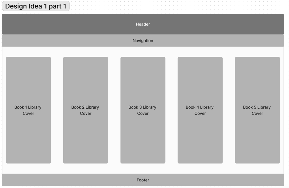
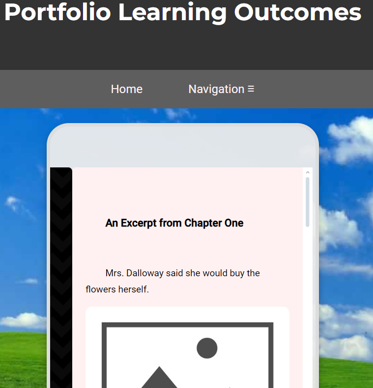
While creating a prototype for my website, one of my ideas was to create a library from which I could grab books.
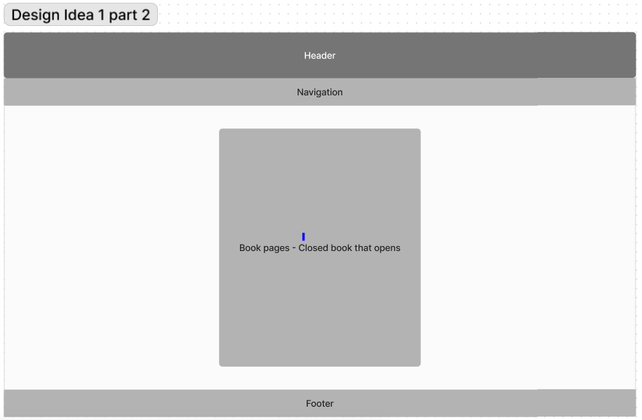
Each book could be grabbed from the library shelf and would start out closed.
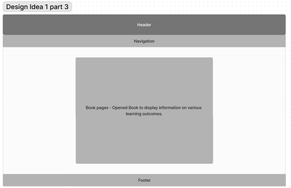
The book could then be opened and scrolled through.
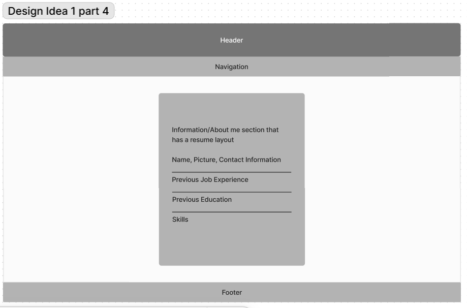
This design featured a singular div on an about me page that contained information about me.
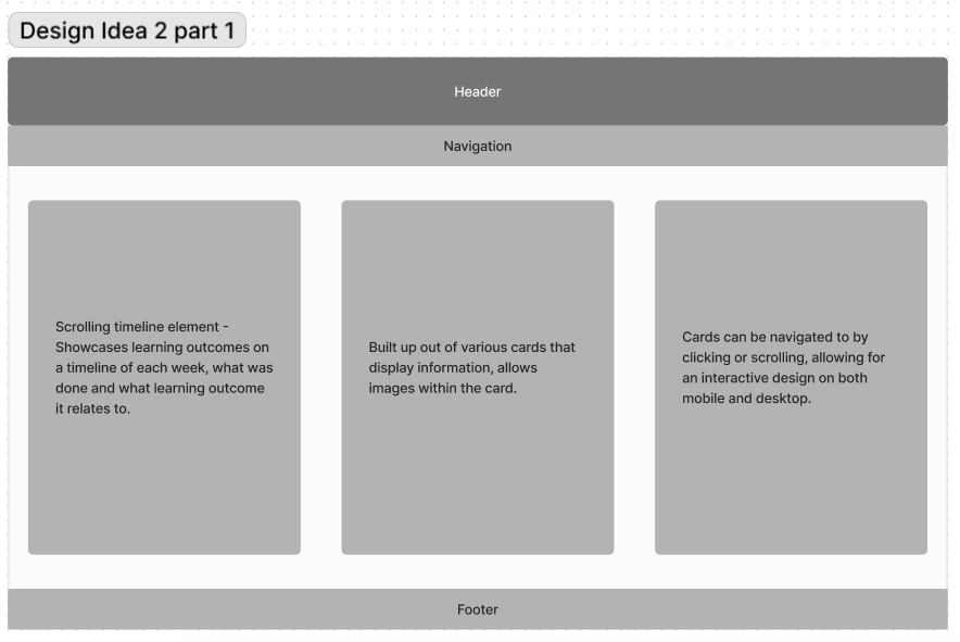
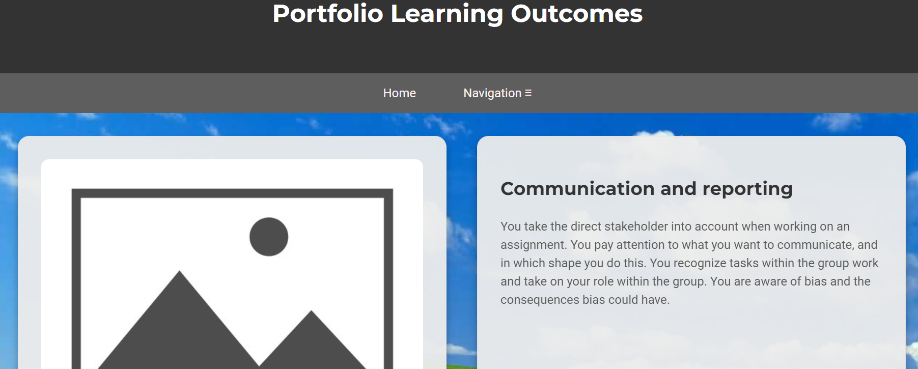
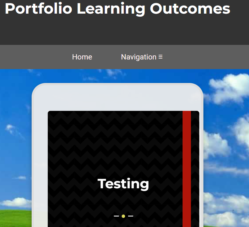
A second design idea featured these side-scrolling cards.
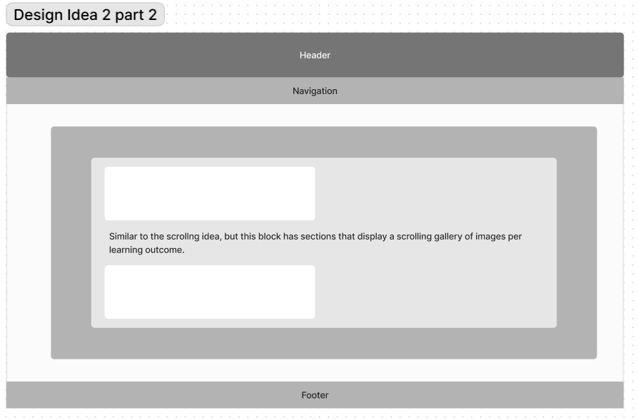
This second design also showcased the learning outcomes in a sort of scrolling gallery, with text below it.
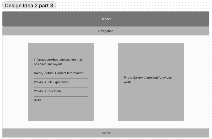
In this design idea, the about me page was set up more as a scrolling card page as well.
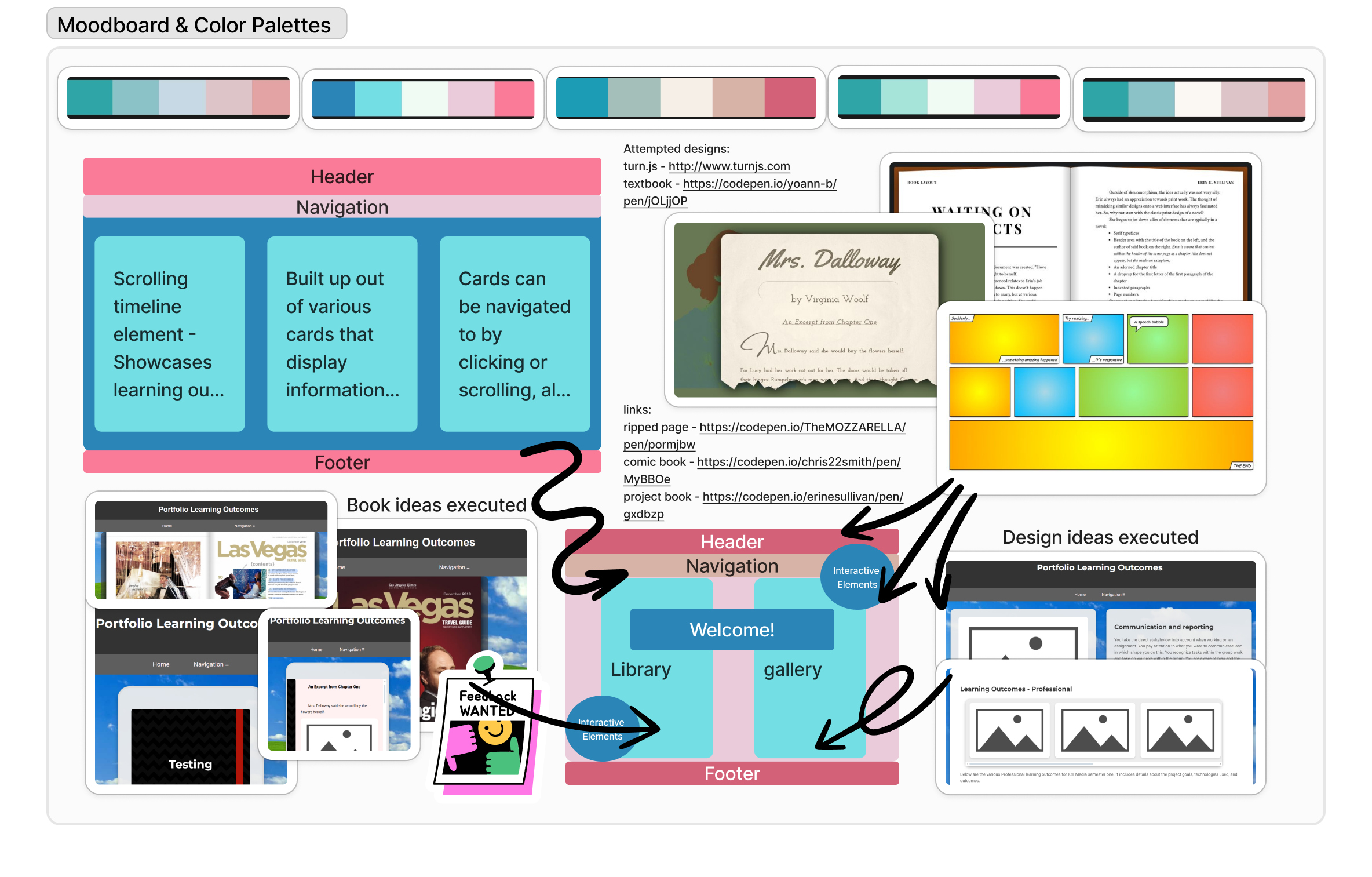
A moodboard for my design prototype that had various ideas, color palettes and the like for the setup of my website.
This is one of the very first iterations of my website. Before this, I had failed to create a flipping page element (I had created a div which flipped... text included).
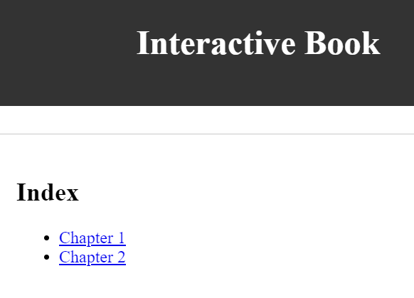
For my second iteration, I tried to figure out how to bring my book idea to life by creating an index with chapters.
In this third iteration, I tried bringing my scrolling card design to life.
This iteration of course also included my scrolling gallery learning outcomes page.

For my fourth iteration, I tried looking at pre-existing code that implemented the books in a system similar to what I wanted. For this iteration, I found turn.js.
Turn.js was an e-book api that could create a library and a book in the way I had in mind for my design idea. This design ended up being too complex for me to work with, as I was inexperienced with JQuery.
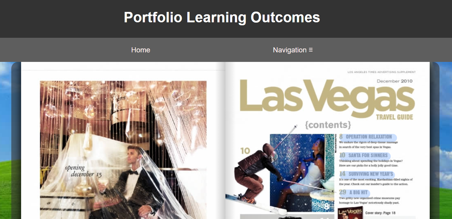
To continue with my book design, but avoid working with a complex api - I looked for a similar code that only utilized HTML and CSS. I stumbled upon this book code.
This book code made use of a cover that would "fold open" to reveal the book content.
For both of my initial design iterations, I had the same about me page layout. It was styled like a Word Document, which I later reworked after feedback.
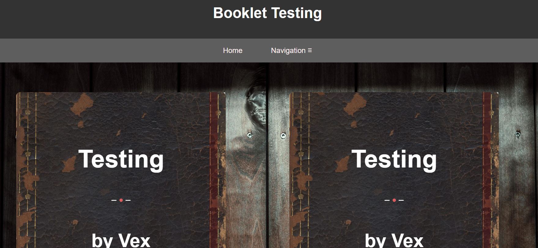
In version 6 of my website iterations, I decided to use the book design from V5 and further refine it. I added some stock photos to the background as well as the book covers to create a more authentic book feeling and styling.
I decided to keep the learning outcomes gallery both to showcase my learning outcomes as well as my projects. I improved the styling and created my own background by using a screenshot from a Virtual Game. (SecondLife)
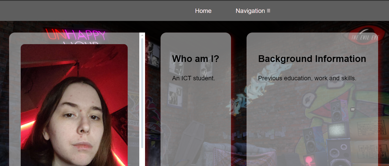
To improve upon my about me page design, I decided to use the scrolling cards design to allow for an interactive and interesting display of information. This background also features a screenshot (gif) from Second Life.
One big problem I ran into with creating my book design was this issue with the header on smaller view widths. I asked multiple times for help, but it took three seperate teachers offering advice before the actual problem was adressed. By editing the book content width to properly fit the page, the header once again properly stretched across the entire page.
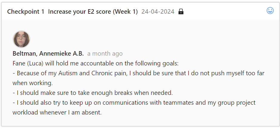
My first feedback checkpoint focused on personal goals. I was recommended by a teacher to watch my own health and to make sure to take breaks when needed. As a chronically ill student with Autism, this was definitely a must.
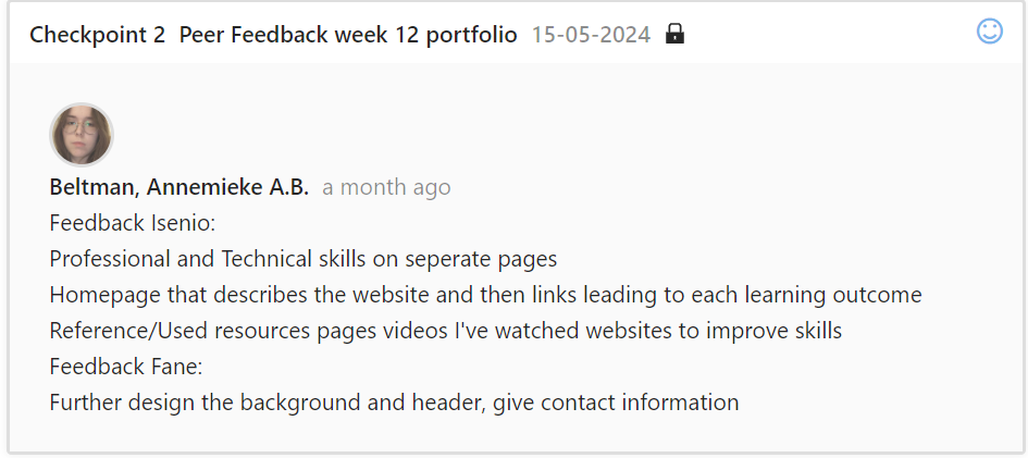
My second feedback checkpoint involved feedback from classmates. This was feedback given in the initial design stages, before a majority of the main pages was created. It was recommended that I create a home page as well as an about me page.
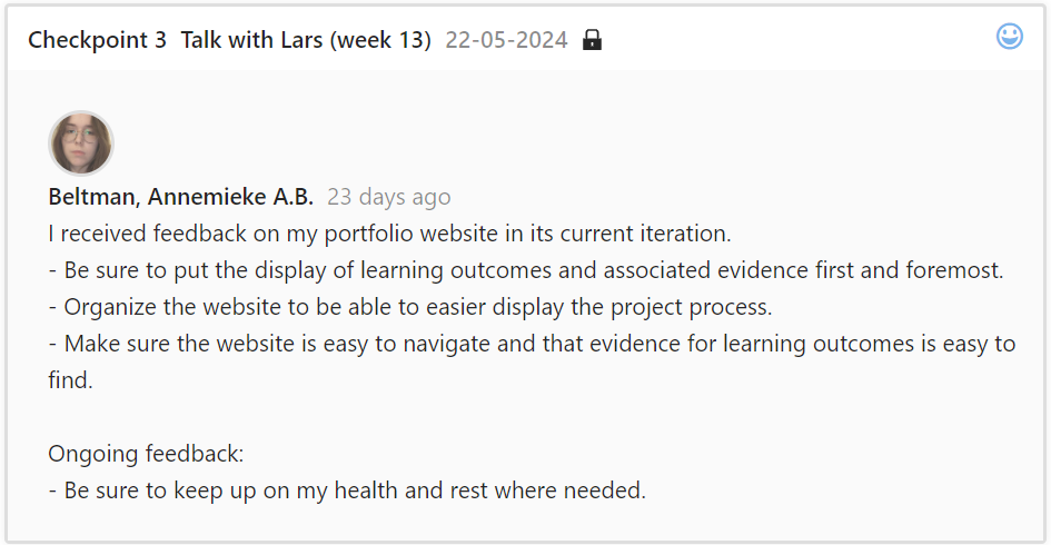
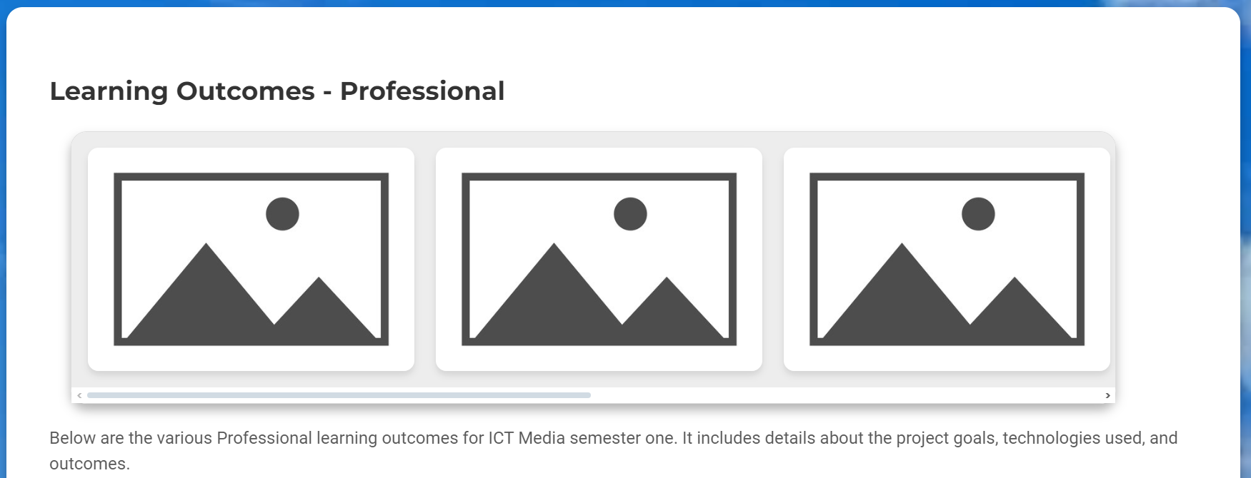
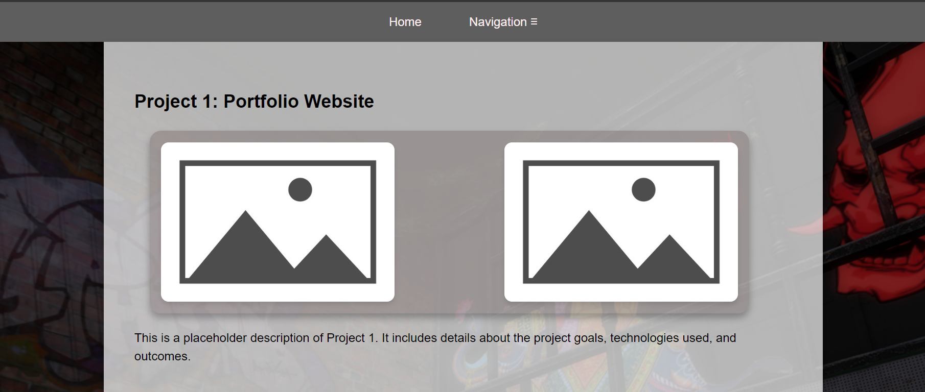
For my third feedback, I was urged to put my website design focus on displaying the learning outcomes as clearly as possible, as well as focusing on ease of navigation. Throughout some iterations, a common feedback was advice against the use of "walls of text" (such as on the learning outcomes gallery page). Thus, I created this Evidence Gallery page for ease of access. This also offered various methods of navigating through provided evidence - for both visual and text based audiences.
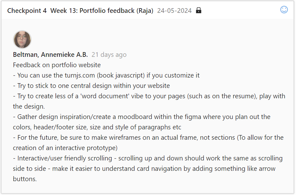
During my fourth checkpoint, I was given the go-ahead to try out turn.js. I ended up not using this design due to a lack of skill working with JQuery. I was also advised to stick to or create one central design for my website, and increase readability on certain points of navigation. I implemented this feedback where possible, but wanted to continue experimenting with various website design iterations.

For my fifth checkpoint, I met up with my semestercoach in another ICT building to give a full overview of my portfolio and work progress so far. Due to unforseen circumstances, I was unable to gather as much feedback as I would have liked, and was adviced to get on top of this. Alongside this, we discussed the possibility of asking teachers for feedback via email.

During my sixth checkpoint, I was advised that I might benefit from a flexbox display on my learning outcomes page, instead of a scrolling design. I comprimised with that feedback by creating this Evidence Gallery page instead, which shows the full scope of each evidence item, instead of a brief overview with lightboxes. I was told to use semantic elements - even though I was already using them in the form of headers and footers. I ended up also enclosing the page elements in a main element, and removing the google fonts links.
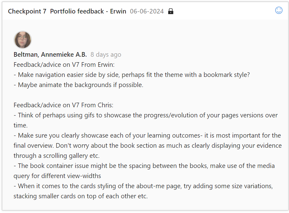
With my seventh feedback checpoint, I received advice from both teachers. I was given some design tips - such as using a gif for the background or a gif to showcase different design iterations. I implemented these features, while making sure my gifs were properly optimized (small file size, no bigger than 8mb) and worked as intended. I was advised to showcase my learning outcomes - but that they did not need to all be present quite yet for the upcoming website iteration overview. I ended up writing the basics for each learning outcome, how I completed it and adding a few images instead of placeholders. However, at this stage, the majority of the images were still placeholders - under the assurance that it did not yet have to be entirely completed. I focused on processing the design feedback instead.
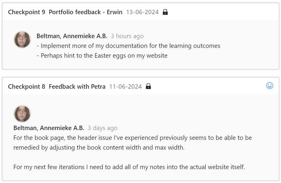
For my eight and ninth checkpoints, I received very little feedback. I received help for a long-term issue I had struggled with in my HTML CSS book design. I was also advised to add notes I had taken about my work process into the actual website itself.
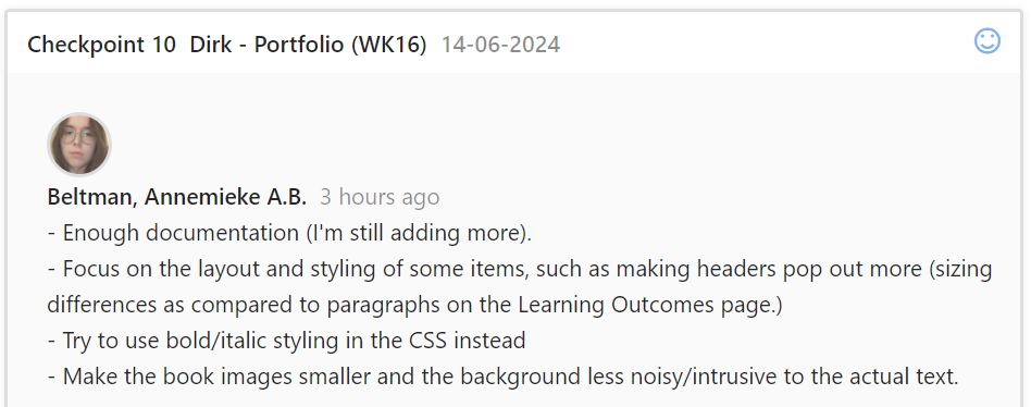
During my tenth checkpoint, I was told I had showcased quite a bit of documentation, and that it was displayed clearly. I was advised to work on my layout, and make certain items such as headers pop out more and improve readability of the books.
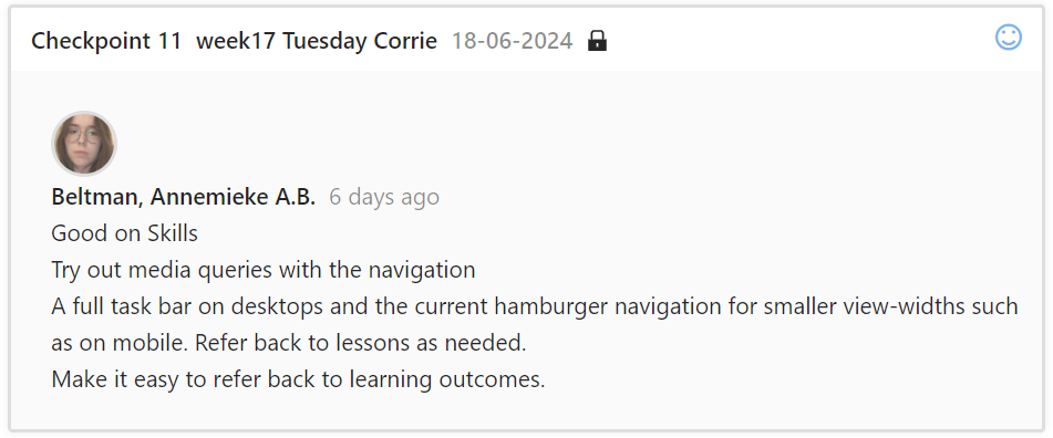
After receiving some feedback on my progress so far, I decided to focus on what needed to be done for my skills when asking for feedback during my 11th checkpoint. I was told I was currently up to par with skills, but advised I could try out some changes with media queries. I Implemented this feature in the following iteration.
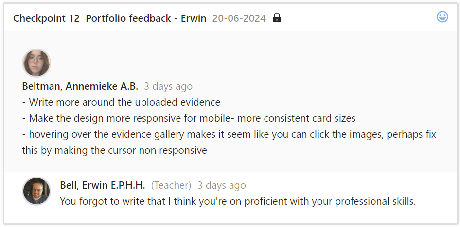
During my 12th checkpoint I asked how I could improve my professional skills. I was told it was up to par, but that I could work on refining and adding more evidence.
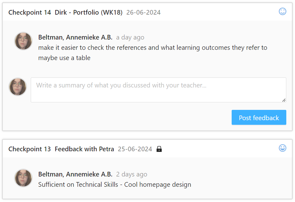
Final feedback gathered to confirm sufficiency of skills. It was suggested I create a more direct reference page, but due to time constraints, this was not possible.
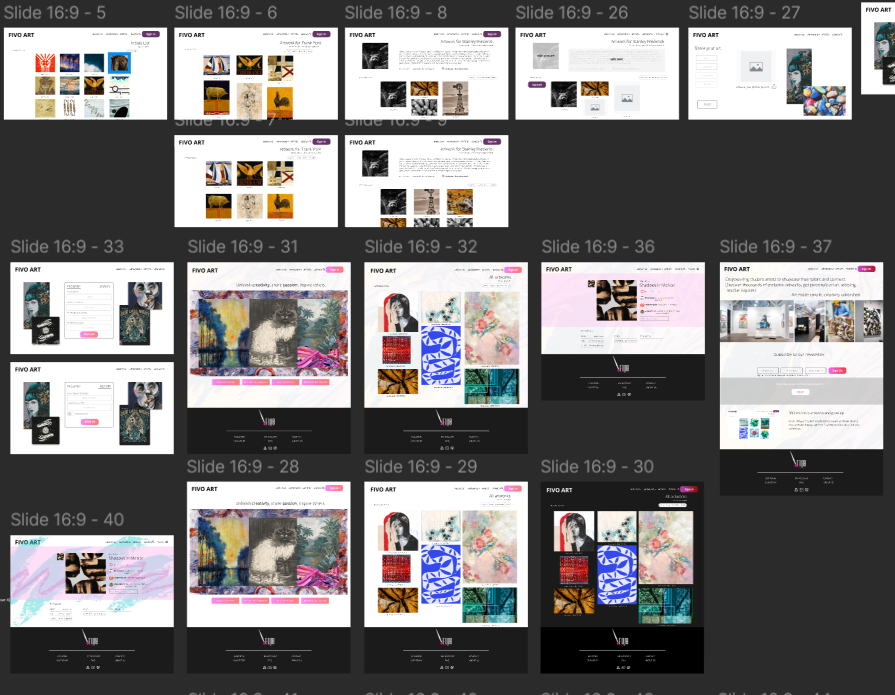
For my FIVO group project, I helped design pages during the prototyping phase.
This is a closeup of some of the pages that were designed during the prototyping phase.

I created a survey alongside my groupmates. This is the introduction paragraph to the survey.
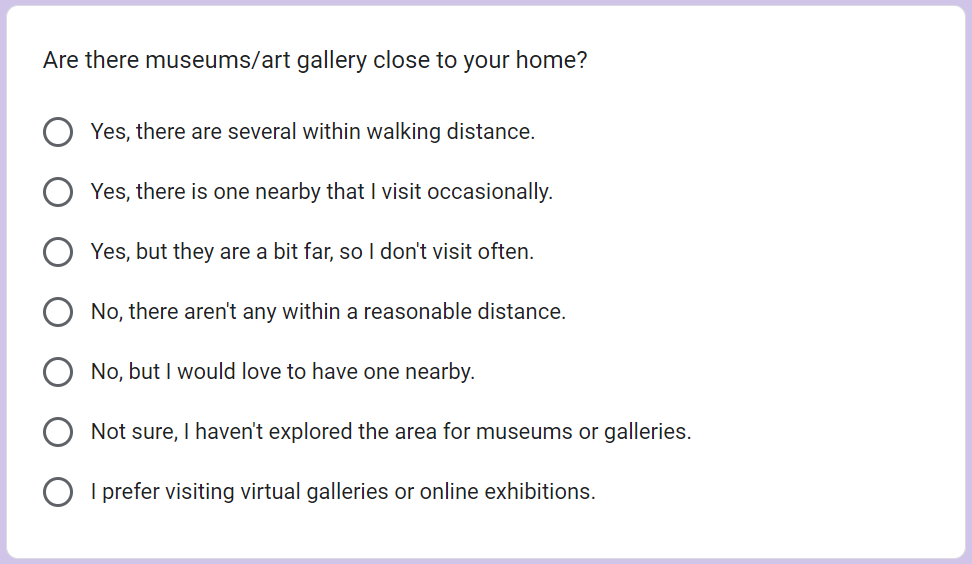
This is an example question of the survey.
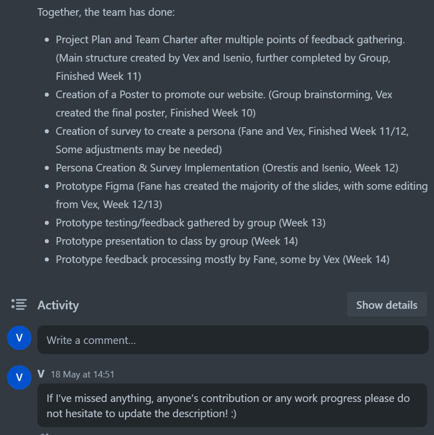
During the final phases of our project, I created the structure for a project report, and filled in most of the already known information. I also helped set up the structure and create the project plan and team charter alongside my groupmates.
Our group created a few different website poster designs. Ultimately, we settled on my design, which I created and processed feedback on.
I created the basic structure/layout for our final presentation.

During the creation of my poster, I also created this Logo for our project. It made use of a paint brush stock asset from canvas, as well as a unique typefont combined together to create this image.
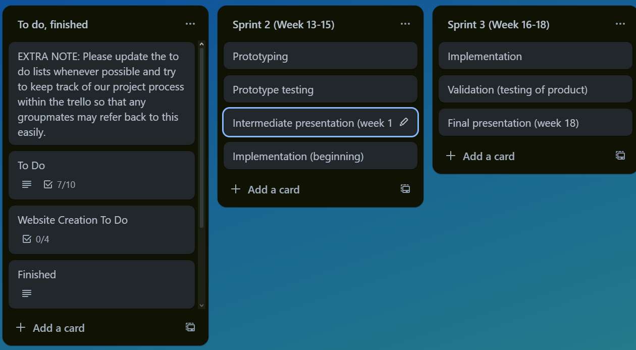
I was the main creator and upkeeper of the group project Trello board. This included an overview of each sprint, what had to be done each week as well as keeping a team log and to-do list. It seemed like noone else was using this trello, either by refusal or simply disregarding its use.
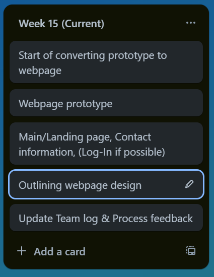
I would update each week to the currently active week, and "archive" weeks that had already passed. Each week showcased the goals for that week.
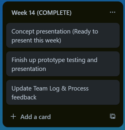
Completed cards were put at the back of the row, out of sight but still accessible. People kept up on their tasks, despite barely interacting with the Trello.
This is one of the many To Do lists I created on the Trello, which helped to showcase active tasks that needed to be done. One of these to-do lists included pages each person had to create, allowing for a quick overview of task delegation and preventing people from doing too much or too little work.
It seemed people within the group picked up work where necessary. We did not often communicate explicitly on who would do what, but we tried to pick up on tasks when needed to keep an even divide. These updates were tracked on the Trello Team Log.

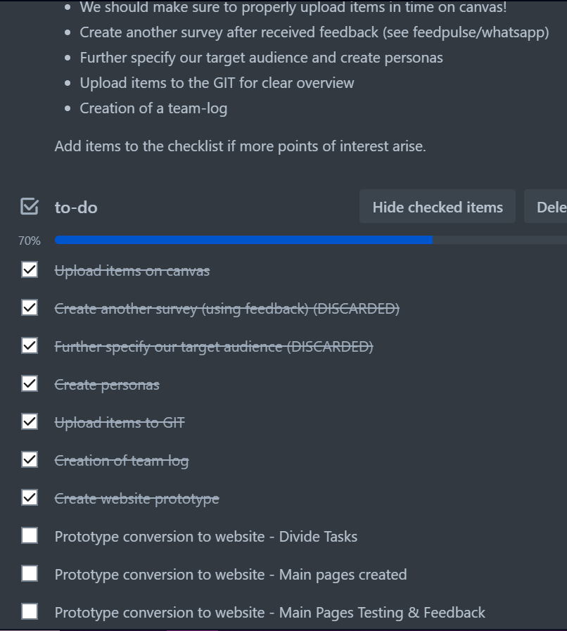
For the final week of iterations, I created an extra page within the Trello that compiled important feedback and features that still needed to be processed and added.

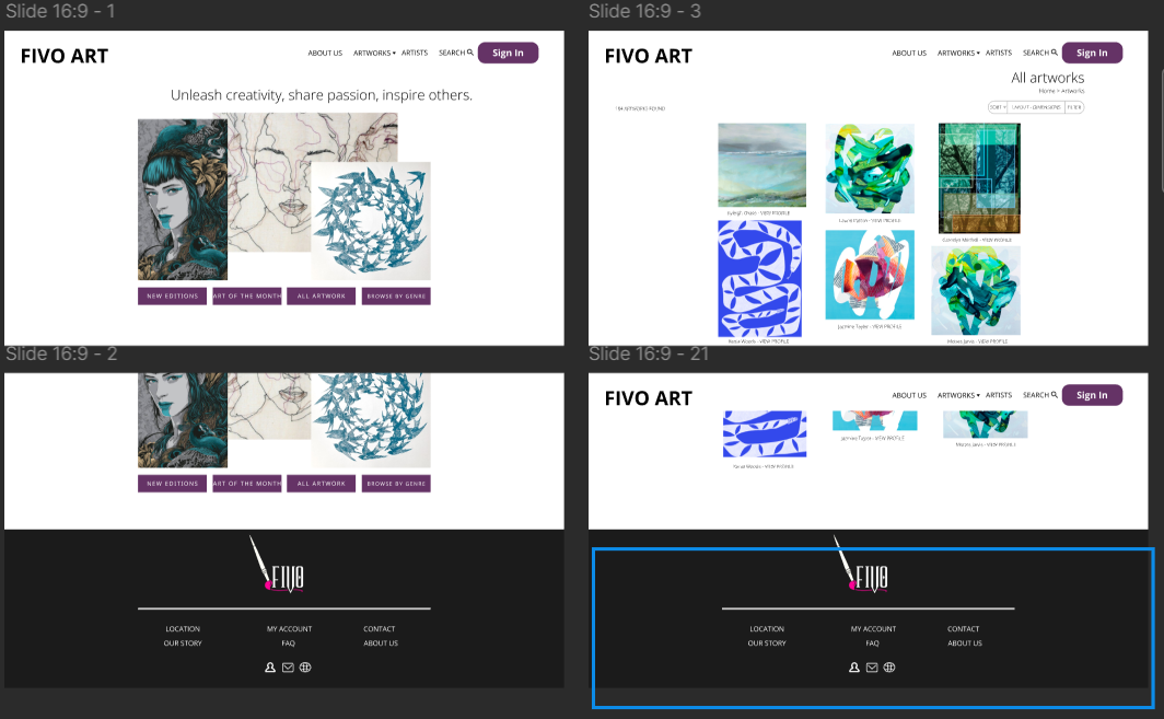
One of the webpages I designed for the FIVO Project.

One of the webpages I designed for the FIVO Project.
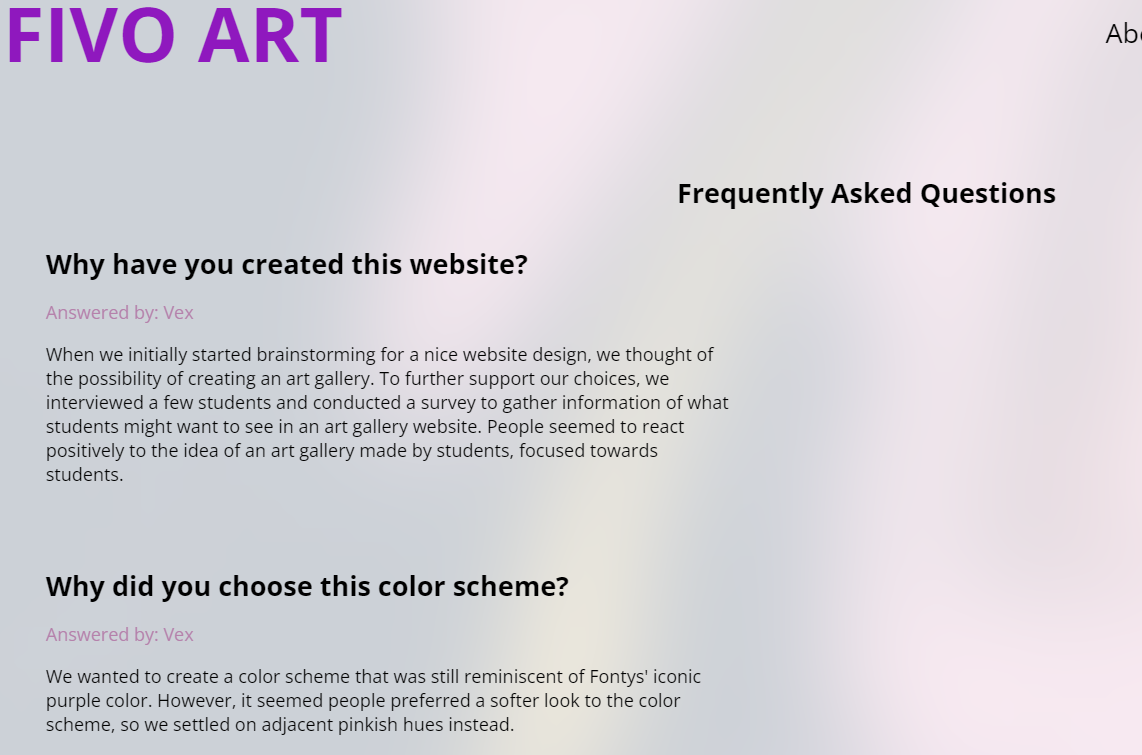
One of the webpages I designed for the FIVO Project.
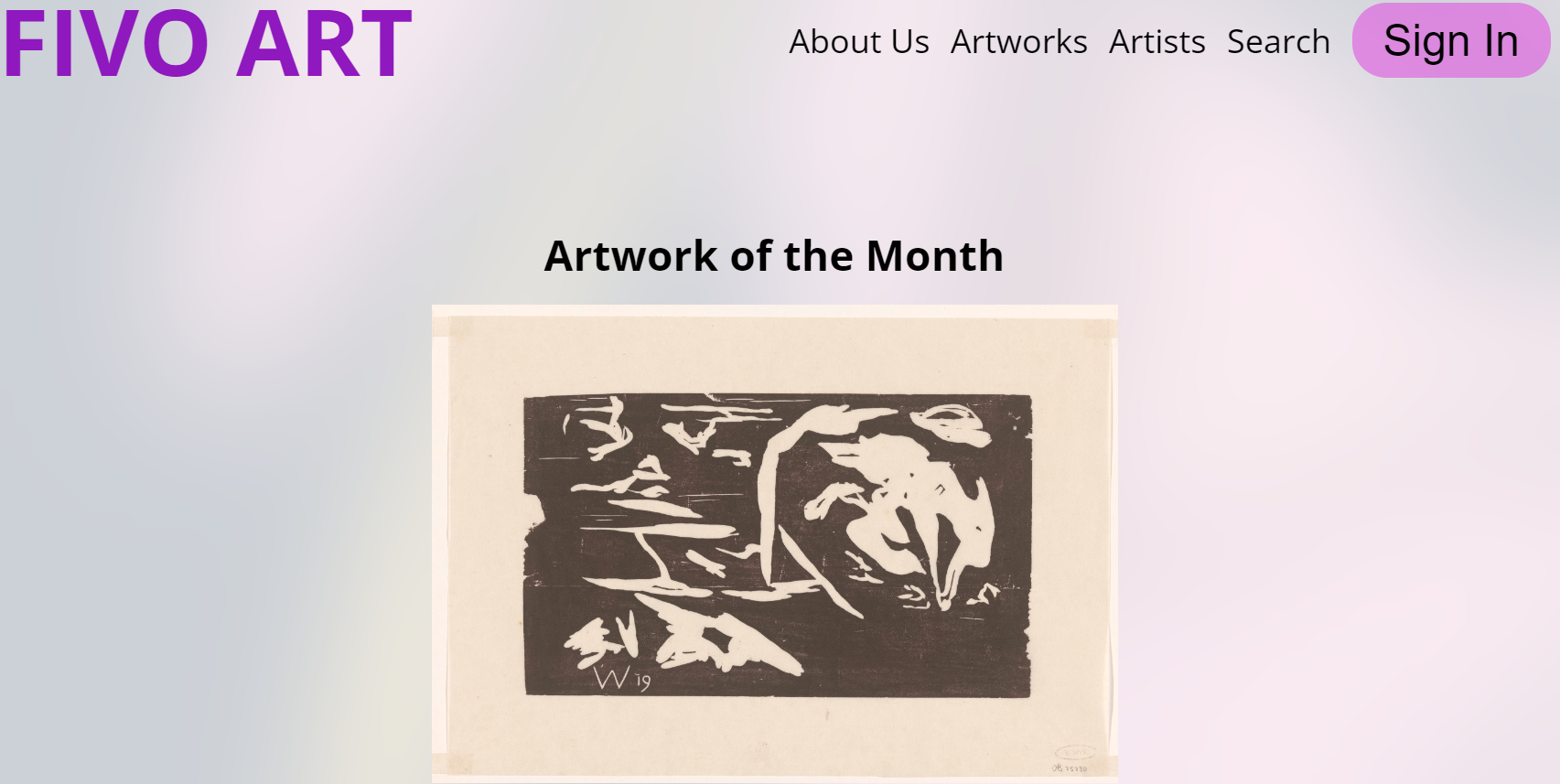
One of the webpages I designed for the FIVO Project.

First feedback checkpoint for FIVO.

Second feedback checkpoint for FIVO.

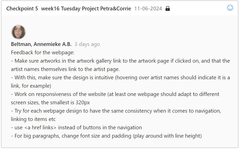
Third feedback checkpoint for FIVO.

Fourth feedback checkpoint for FIVO.
Fifth feedback checkpoint for FIVO.

Sixth feedback checkpoint for FIVO.

Seventh feedback checkpoint for FIVO.

Eigth feedback checkpoint for FIVO.
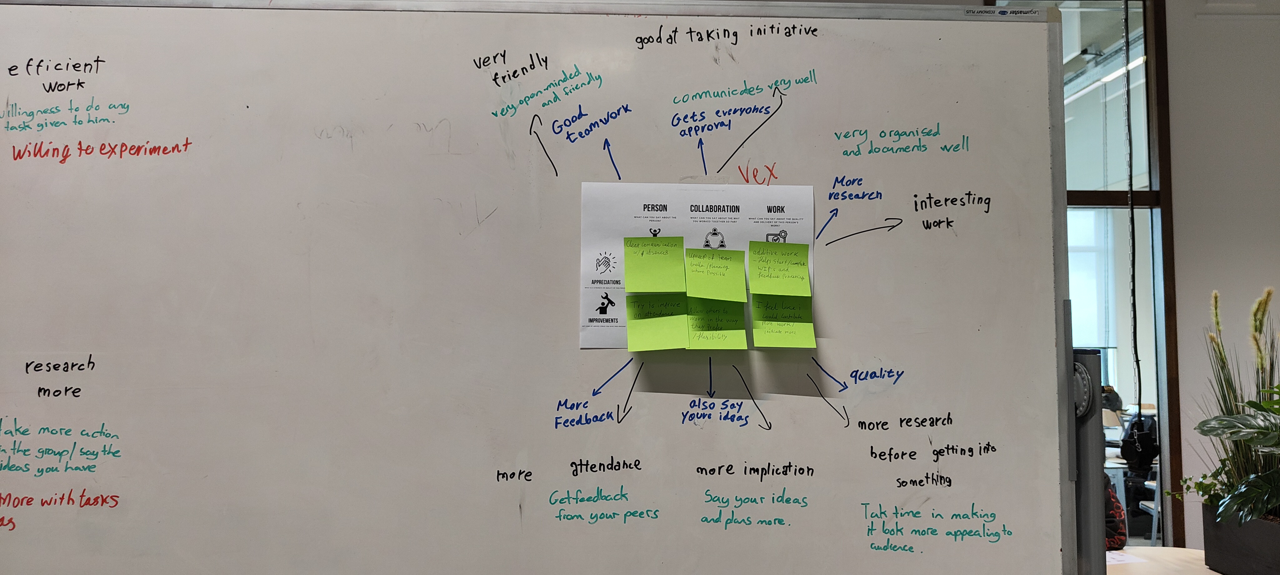
A general overview of feedback I've received from teammates- what can be improved upon and what is already going well.

Closer view of personal notes on what can be improved.
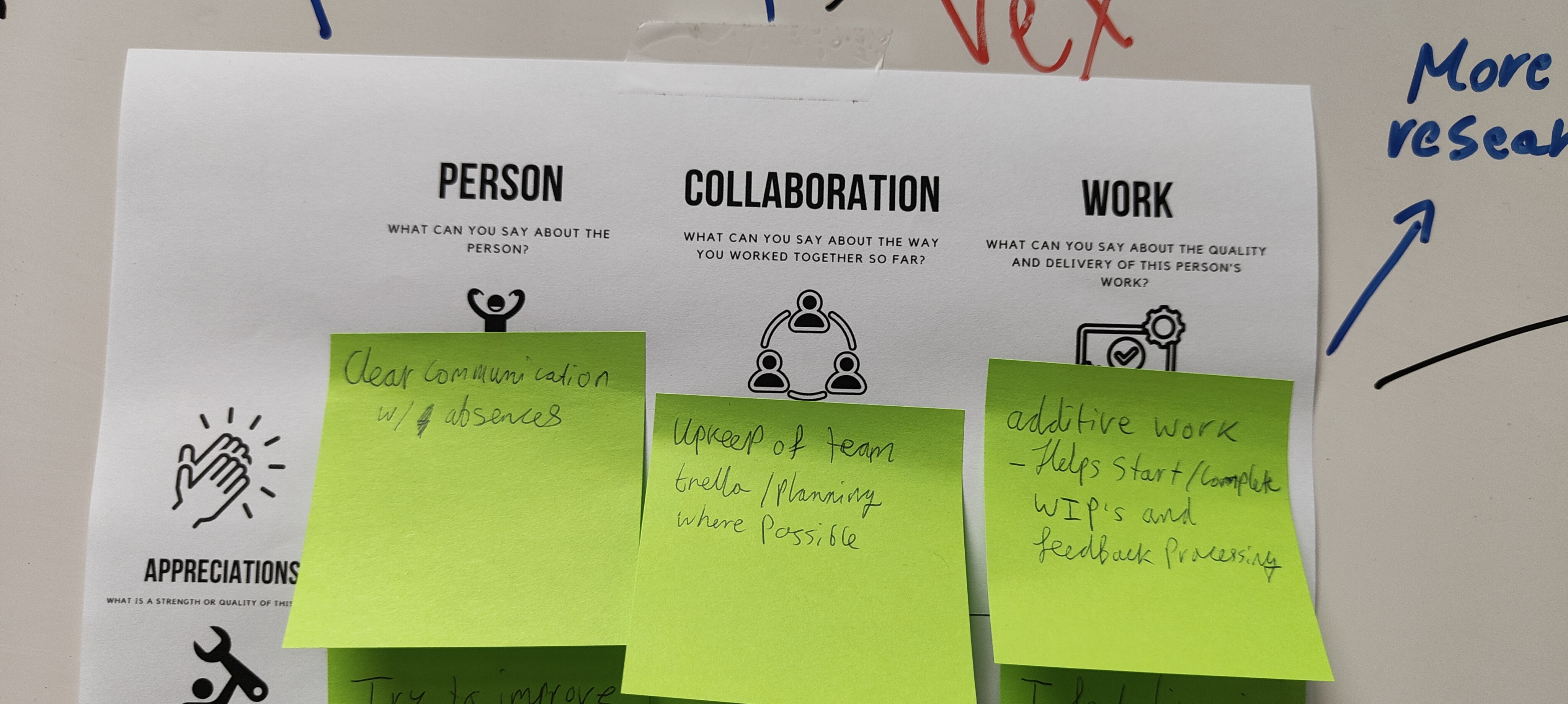
Closer view on personal notes for what is already going well.
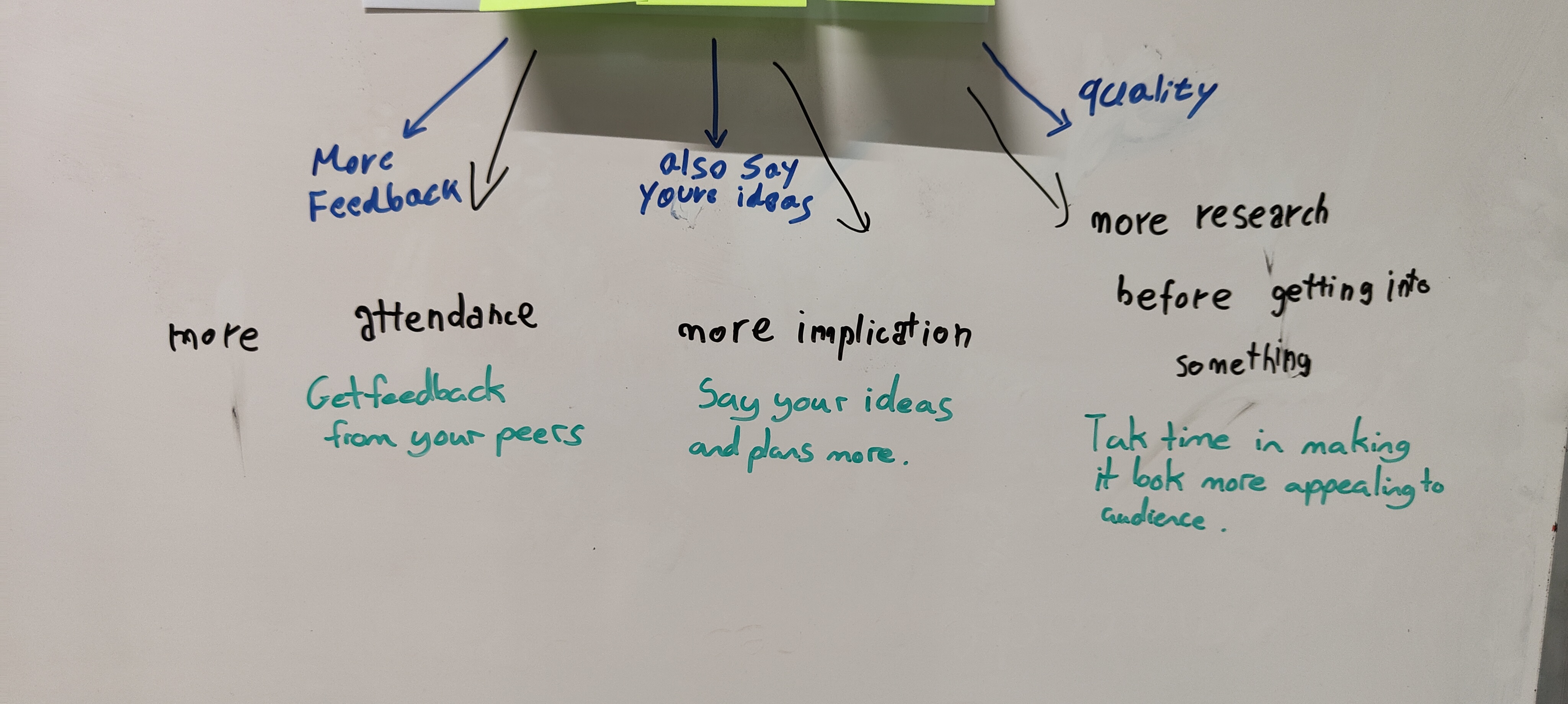
Teammate feedback on what can be improved, including researching more and stating my ideas more in the group. I've done this by offering my input and creating a powerpoint.
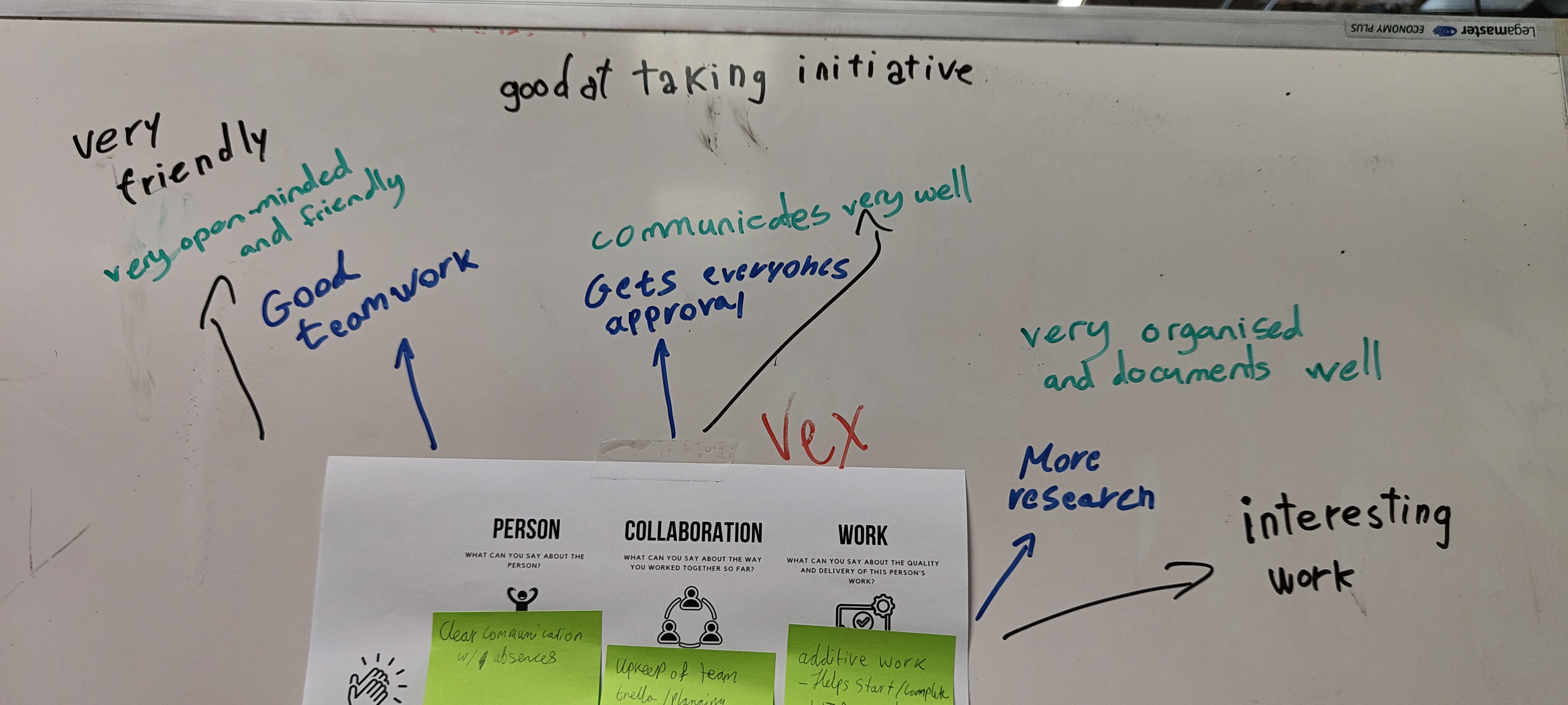
Teammate feedback on what is going well.